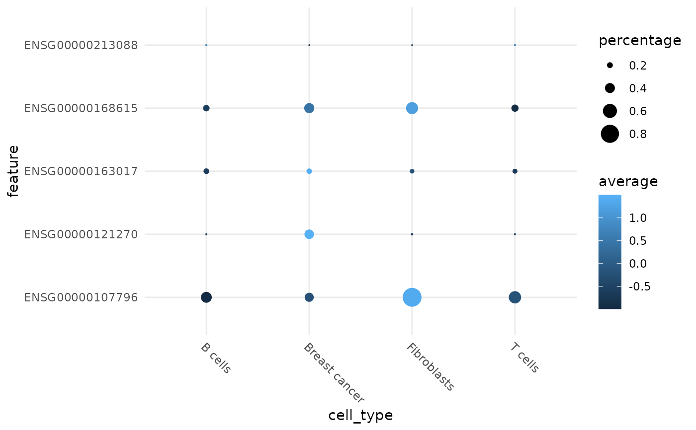
Visualizing average expression and percentage of cell that expression a certain gene(s). Similar to Seurat's DotPlot.
Usage
plotDots(
  spe,
  feature,
  assay = "counts",
  group.by = "cell_type",
  detection.limit = 0,
  expression.limit = c(-Inf, Inf),
  scale = TRUE,
  cols = NULL,
  dot.scale = 6,
  flip.axes = FALSE
)
Arguments
- spe
A SpatialExperiment object.
- feature
vector of feature names.
- assay
Name of assay to use for plotting feature.
- group.by
values to group plot by. Must be in colData of spe.
- detection.limit
threshold for minimum expression value for percentage expression calculation (dot size)
- expression.limit
Upper and lower bound for average expression. Values beyond this range are snapped to this limit. If only one value is provided, it it taken as the upper bound.
- scale
Whether to scale the average expression data of each feature using scale.
- cols
Custom color palette.
- dot.scale
scale the radius of the plot. See scale_radius
- flip.axes
Whether to flip the axes.